Bee-Tee
Blue Tactics
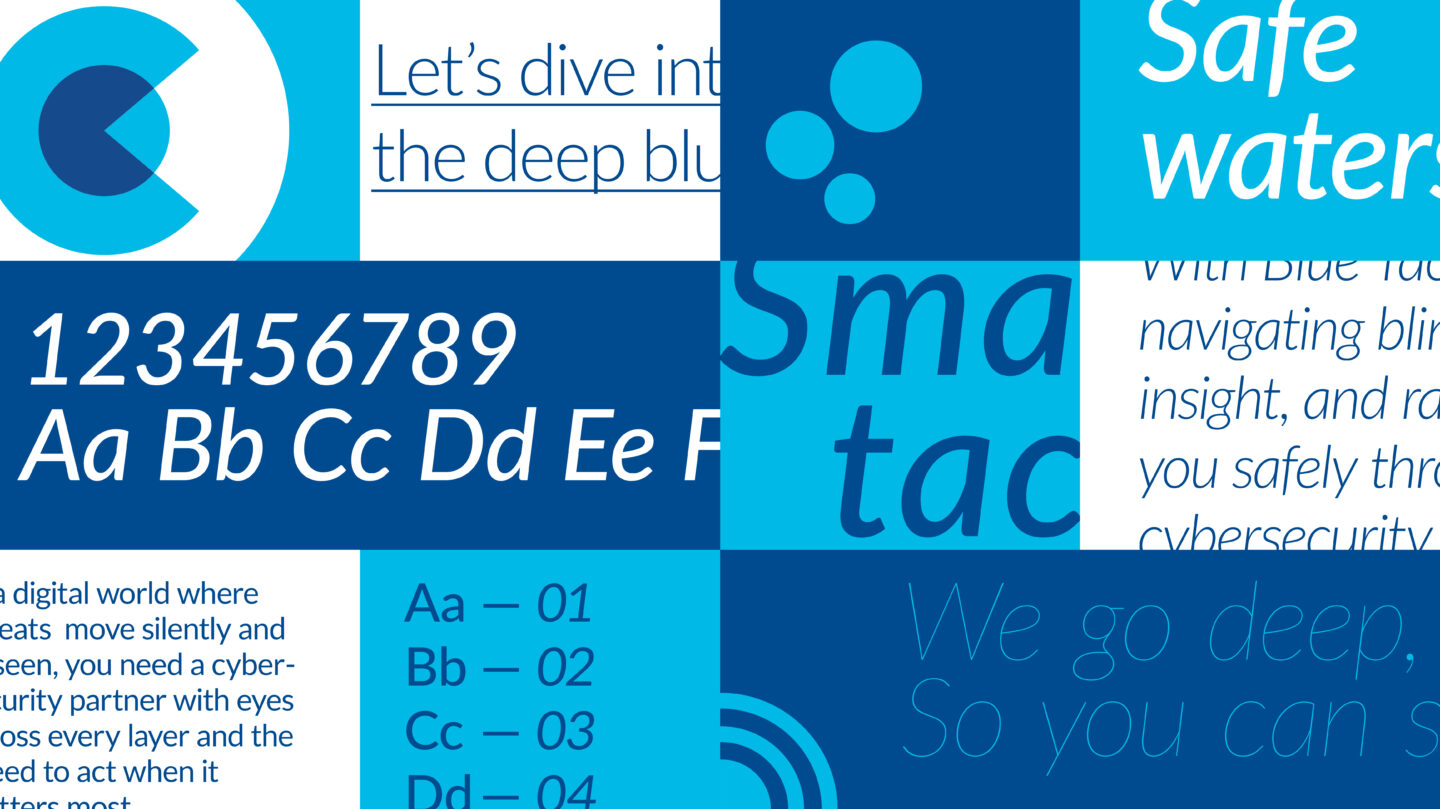
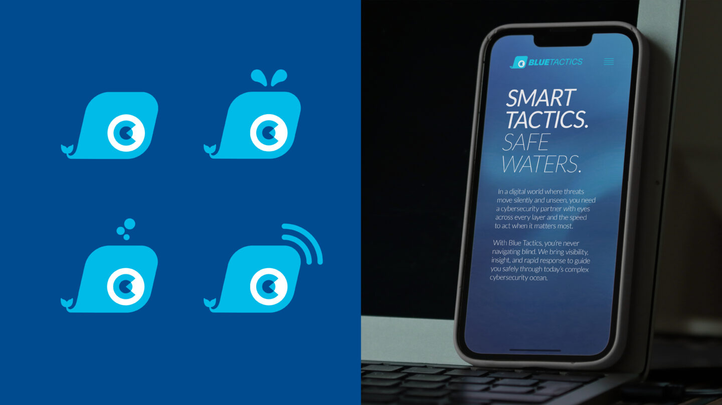
Blue Tactics is a cybersecurity brand identity built around visibility, awareness, and fast response in a changing digital world. At the center of the identity is Bee-Tee — a custom whale symbol with an integrated eye, representing smart detection, awareness, and the ability to spot threats others might miss. The whale also symbolizes the ability to dive deep into the unknown, exploring hidden layers beneath the surface.
The typography has a slight forward angle to create a feeling of movement, speed, and precision, reflecting the company’s tactical and responsive approach to cybersecurity. Together with fluid ocean-inspired gradients and dynamic visual elements, the identity combines technology and trust with a calm but alert feeling.
More than just a logo, Bee-Tee was designed as a flexible visual system with different states and motion-inspired variations, helping the brand feel modern, adaptive, and alive across digital platforms.
Creative/Art Director: Max Rosell